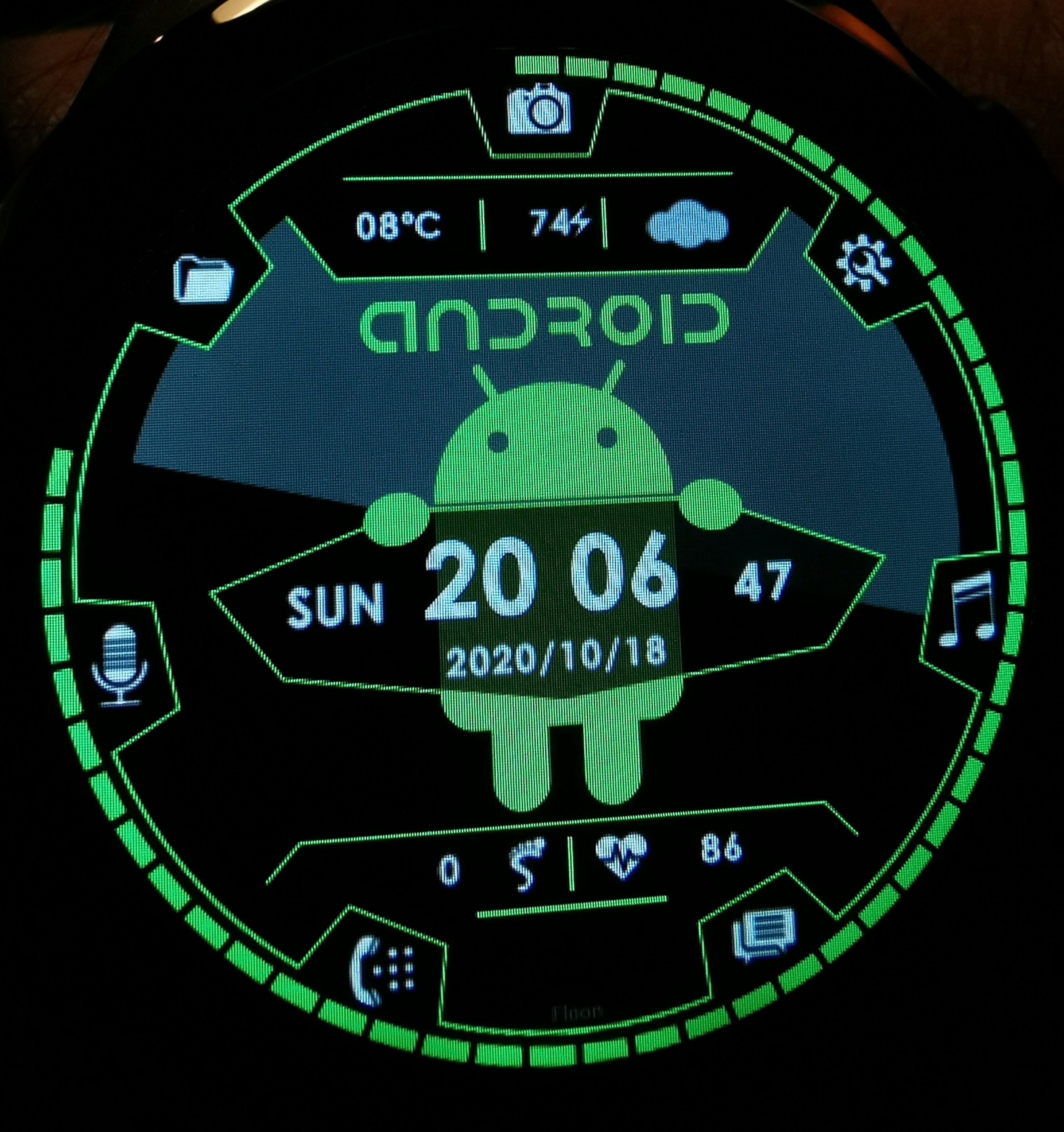
here is an android dial .
i have add touch option :
setting,
folder
calendar,
battery,
alarm-timer-stopwatch,
camera,
music,
microphone,
call,
SMS,
weather,
heart-rate,
steps,
I test them with my kospet prime 1 watch (32gb)
(( for dial 1.6 inches with a resolution of 400 x 400 ))
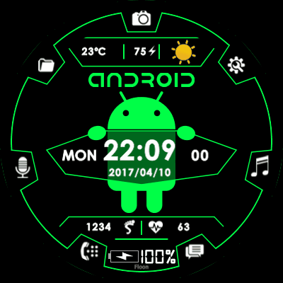
Very nice. I really like the Android figure, hinting that we have a real Android watch , which none of the other types are. And the app shortcuts are also very nice. Personally I’d prefer the white rotating field to be dark grey, close to the black colour. I find the white too dominating and making the watchface difficult to read.
thank you for your opinion
I played with the colors white, green and black.
the white and black rotating field rotates with the seconds
have you tried it on your watch?
I am sorry it looks like that - I have unzipped the file, edited 1 image by name image1.png (made the White Grey), zipped it again and installed.
I doubt that signature was in this rotating image ?
Actually, please zoom my picture, and you will see that it is still there, only the dark grey text on black background makes it very faint. And I guess the bad quality of my picture too makes it faint.
I have no reason whatsoever to remove your signature. Please trust me.
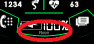
Ok, so it’s the symbol of charging
I just didn’t get it because the percentage isn’t the same as in the top battery status, and within the watch there can only be one number (as we can’t see the phone charge).
Again, feel so bad that I made you think I removed your signature. I have only very positive memory of your contributions to the community!
It’s really the quality of my picture combined with the dark grey font.
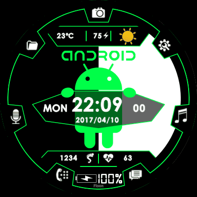


 , which none of the other types are. And the app shortcuts are also very nice. Personally I’d prefer the white rotating field to be dark grey, close to the black colour. I find the white too dominating and making the watchface difficult to read.