Tron
Back from my ski trip and I’ve finally finished this one.
https://drive.google.com/open?id=0BysDzZ6Uvo9nRHM4aU9zS1JCT2M
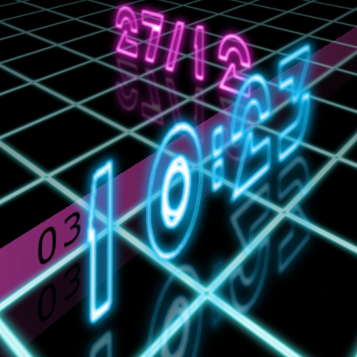
A 3D glowing neon digital watch with a Tron feel. The time is in the foreground and the date in the background, Australian/European format (sorry to my American friends).
The graphics and colours are my own and no graphics from the movie were used. I did however modify a font created by Jeff Bell from here http://www.dafont.com/tr2n.font. To each digit I applied neon effect and angled it to match the correct perspective.
I had the same issues as the cube watch face but I also added perspective and reflection. That’s 8 pictures per time digit, 8 per date, 4 per second + colon + slash, that’s 204 different images (+Andrew Davis I feel your pain).
Every 10 seconds the light trails briefly illuminate the seconds at the bottom left and the top light trails momentarily knock over the slash of the date.
And at the 5sec mark there’s an Easter egg for @SmartWatch_Ticks .
It takes 2 sec to load because of all the images I think, but it should look good on a square watch and gr8 on an Amoled, let me know, those that have one.
To protect this skin I have added my signature and embedded watermarks.
1 Like
Photo looks stunning… I can’t wait to dismember it… 
And I wondered where you’d been… you’d been so quiet I had to make extra noise just to fill in… 
Quite beautiful… top of the class Mr S…
Looks good on CSM… let’s try my D5…
Absolutely cracking!!!
Where’s your Paypal donations page?
I get the drift of your line
That’s something new - different dimension on D5! Need to reassemble it
Just checked it on my D5 - absolutely magical. Animated lines and even the flapping date slash - amazing. Truly amazing. Just realised I know nothing about watch faces designing.
@Piotr_Blazewicz Of course you do… it just gives you something to aim at…
I can confirm, the static image seems very good, but viewing it in action leaves you speechless. It gives you the impression of using a far better engine than the limited one we have on our watches.
The conclusion is: the limits are only in my mind, not in the @Andrew_Somers one clearly
You must have been working on this for a long time Andrew! I think NASA could really use you for a Mars mission. Wow. And thanks for the Easter Egg! I can see I’m going to have to play with it when this skin is featured on YouTube. It seems again that the bar has been raised. The reflection is an extra special touch.
Oh my goodness… that looks amazing!! 8?0
23:35 - Just installed this on my X5… Seriously, WOW!! amazing work @Andrew_Somers !!
Wow. Just installed it. Wow.
Isn’t this thing absolutely cool @Julian_C ? Say @Andrew_Somers , any chance the falling stash mark could change color as it goes down, like bright yellow/orange so it looks like it got zapped? I can’t imagine all the masks involved in this. Wow!
Unbelievable…Stunning piece of Art!
@SmartWatch_Ticks It would be very easy to change the slash colour or make it break apart, etc.
ps: Working for NASA would be my dream job. All my life I’ve wanted to escape the oppression of Earth’s gravity
Thanks for the great comments guys, gave me a real buzz.
This one did take a long time, especially to polish the floor to get it so glossy
This maybe TL;DR but I feel like a monologue (it’s therapeutic after all that work)
There were many variations and tryouts before the finished product you see. A lot of scaling and adjusting to get the digits to just fit the boundaries of a round watch for single and double character combinations.
I gave Gimp’s perspective tool a real workout. Once I got the grid down I could use it as a guide, but most things were aligned by sight.
I thought I could just flip the numbers for the reflection but that didn’t work. For each digit I created 4 in a row, copied and flipped vertical underneath to give a panel of 8, then used the perspective tool to line up with the ground grid. I did a screen grab just before executing so I captured the guide lines. I loaded the screen grab back into Gimp and used this as a guide when doing the other digits perspective. With this twisted perspective panel I dimmed the bottom reflected parts and chopped them up into individual digits, saved as separate files, naming convention a0, b0, c0, d0, a1, b1, etc. I probably could have recorded a script to repeat this, but I sometimes need to tweak things. The xml has a separate array for each digit offset +100 or -100 for the 10’s or 1’s.
Light trail masks are a good way of making something move in a straight line across the screen. The masks hide the curved nature of a rotating object beneath. Originally I had a flat mask, but it looked, well, flat. Then I overlaid 20% black on the left sides. This defined the edges and the 3D effect popped out.
The light trail reflections in the background looked dimmer (because they are smaller I think) so I went back and adjusted the opacity of the reflection part of the mask from 30% to 40%
I did the date the same way as the time, but the shadow looked too dim for the same reason as the back light trails, so I went back and increased the opacity of the reflections only.
I originally did the seconds (and the hidden text) with no reflection (trying to take a shortcut) but it spoiled the whole effect, so I bit the bullet and went back and redid all those. However I didn’t bother with 5-9 because the light trails had faded so you can’t see those.
The date slash flip was actually an after thought.