…and now, on your watch!
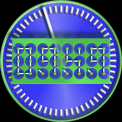
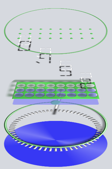
More of a proof of concept than anything else, I guess. I had trouble with the transition from 23:59:59 to 00:00:00. The 3 skips to 9 then to 0. I tried masks and everything else I could think of but hey, who gives a crap? 
It’s more complex than you think with so many images the file size is over 13 Mb!

Click Me To Download
9 Likes
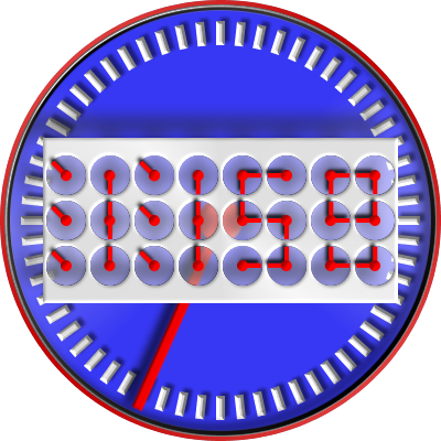
Very nice concept. Could I suggest a better highlight of the hour by, I don’t know, a more eye-catching color? Anyway, as usual, awesome.
1 Like
OMG, Doons nailed it… You are one crazy dude!
2 Likes
After doing this one, I am beyond hope! 
1 Like
I was thinking of that also trying to find the best contrast.
How about this? Good 'ol red, white, and blue! 
USA (click to download)
1 Like
Much better, but it depends on you, and it is important first to like yourself. God bless America!
1 Like
Interestingly enough, I like the first design more, Louis, simply because you do have to study the face a little more to tell what time it is…and that seems to fit into the theme of the watch better than if you could read it at a glance  Cheers, Doons
1 Like
I might be crazy for saying this, but…even though it’s now proven that Louis is crazy it doesn’t mean that the rest of us are not
2 Likes


 Cheers, Doons


