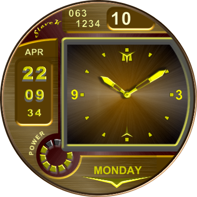
I did something similar recently, but this is more readable.
Final version
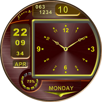
I did something similar recently, but this is more readable.
Final version
Very nice! Thanks for sharing…
Thank you. It’s just an experiment. I will edit it
What is there to edit? Looks great as it is…
Shadows, maybe Roman numerals, more dark backgrounds, I don’t know, I’ll see what comes of it
I mean such minor adjustments …
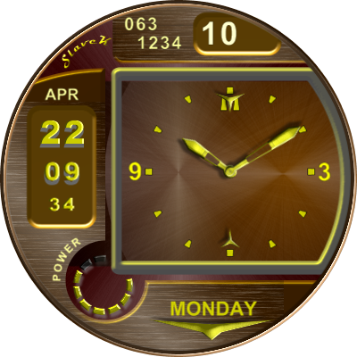
You have a bit of a knack with contrasting colours mate! ![]()
![]() The hand colour is highly visable against the face colour. But then again, all your faces are easily readable. Cheers, Doons
The hand colour is highly visable against the face colour. But then again, all your faces are easily readable. Cheers, Doons