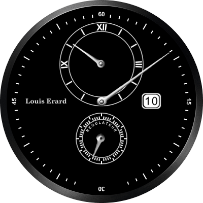
BLACK — Should save battery life! Thanks to @Marco_Ferreira my “REGULATEUR” text is now curved as it should be…
ORIGINAL:
CREDIT: LouisErard.com
BLACK — Should save battery life! Thanks to @Marco_Ferreira my “REGULATEUR” text is now curved as it should be…
ORIGINAL:
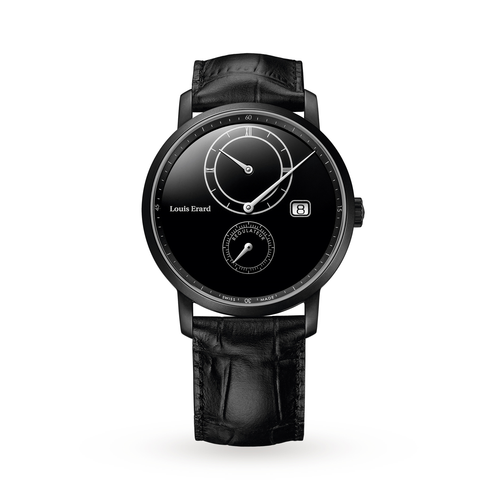
CREDIT: LouisErard.com
Can’t look in it atm, but there is a feature in WFD. You can turn numbers with it, the normal case, or textes also. Let the rest be blank and just enter “regulateur”.
Yes I use that feature in wfd, as you can see from the lettering of Swiss made at the bottom. Unfortunately I can’t find a way to curve the text enough to fit within the curve of the second hand area
just reduce the radius (and, of course change the CenterX and CenterY to the middle of the second hand). Also, depending on the font, you may need/want to play around with the “Digit Spacing” property.
Thank you Marco… I’ll give it a try!
Viola! Success, I’ve been trying for weeks to figure this out 
Great. Now play around with the Digit Spacing (increasing it slightly) and try to get both R’s on “RegulatouR” to match the 10 o’clock and 2 o’clock positions respectively. That will make it closer to the original and improve the readability.
DONE Detail, detail, detail and I’m thankful for your sharp eye!
It’s better now :). The radius is still a bit too large, though. Sorry about these pesky details, but I do believe you’ll have a better/great result.
EDITED You are right, of course, I noticed it on the last edit but - I guess - I was too lazy.
Thanks for the “encouragement to detail”
Perfect. Thanks 
One last question. Among the WFD tools is “squarify” … What is its function?
It’s function is to do the impossible by turning a circle into a square
Kidding aside, the description is not far from what it does. I believe it is easier to see the effect on a tick layer. Put one of those layers on a watch design and move the squarify property to the max value. You’ll see the markings move until they no longer create a circle but a square. The same happens on a text layer, when placing the hours/minutes numbers. Basically, the squarify pushes the location of the “corner” items outside.
Hey Mr. Marco…
Sorry to trouble you, but may I ask what the “local tick fill” and “local tick stroke” checkboxes do in a tick layer?
Thank you for your beautiful program!
Thank you Marco, little by little I’m learning but don’t fear your job is not in jeopardy
To check what local tick fill/stroke does, do the following:
Create a new watch face.
Add a ticks layer
Set the top thickness to 10
Set the bottom thickness to 10
Set the number of ticks to 12
Set the inner radius to 120.
Now you should have 12 large white markings on the watch face.
Go to the fill style and select “linear gradient”.
Now you’ll see that the left markings are white and the right ones are dark gray. The fill style applied to the whole markings as if it was just one element.
Now select the local tick fill and see the diference. The gradient is applied individually to each tick mark… the same applies to the stroke. Of course if you use a single color, then you’ll see no difference at all…
Ah Ha! Sooooo cool thank you so very much for your time!
I am going to have a coffee in your honor, it’s almost midnight here! 
Thank you again!
It is 5 am here… 
5am is unGodly, the last watch face I worked on took a few 5am’ers to complete.
Well doubledad, you have got to just love the way everybody jumps in and helps out on this forum, don’t you? “I’m having a little trouble curving the text” Wham! Bam! Thank you Ma’am! Experts come from all corners of the Forum to help out! I don’t think I’ve ever seen so many people so willing to give 100% effort to helping others out as I have on this forum! And the result? Another fine watch face that we all can share. So Thanks @doubledad,  Thanks @G1NT0N1C, BIG thanks @Marco_Ferreira …oh ok, and an honorable mention @Louis_Peek! Cheers Doons