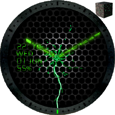
Borg Regeneration Alcove
I redid an old skin of mine that I don’t think I’ve posted here. It’s a Borg regeneration alcove.
I made the seconds around the outside ring pulse on and fade away. Every 5 seconds the alcove lightning will reach out and touch each 5 second marker. The hands are not Borg (10 points to anyone who can guess the language).
As usual there are some easter eggs hidden outside the ring. Move off centre slightly to see the enterprise and Borg ships.
https://drive.google.com/open?id=0BysDzZ6Uvo9ndTFZcGNidjM4X3M
I’ve also posted all my old designs under my Smart Watch Designs collection https://plus.google.com/collection/Qzx3SB.
These were originally in the XDA forum and include some examples of layered masking.

Been going through all the skins looking for anomalies between clock engines in the Q1 and round watches and just tapped into this one. WOW! I get to see what you hid outside of view! Who knew the fate of the Universe was swirling around in Starships and Borg Cubes! Nice job. PERFECT for a square watch. Did you plan this knowing square was coming? The force is definitely with you. Wait a minute. Different series. Sorry. Live Long and Prosper OB1.
I didn’t plan for a square watch. They’re just little Easter eggs I put in. If you drag halfway left or right you can see them. It’s my little secret. I usually sign my work in that space too, it’s not on the main display, but you can see it if you know where to look
Oh, @Andrew_Somers , I’m seeing your signature everywhere in the square Q1! The only place it looks strange is in the panoramas where it follows a circular arc around the otherwise round image in the upper left (which continues around behind your signature, BTW). You might want to rethink that one a bit. PS. So sorry I’m talking about a square watch in a round forum. I feel really bad about it.
OK, interesting to know. Being an engineer, I’d say it was out of scope, or not in the requirement spec, or something like that :). I write Android apps too and testing all the Android variants is a pain. This is one reason Apple restricts the number of device variations they have, they lock things down tighter and it means they can better guarantee things will work.
I hadn’t considered the square layout at all. It’s not just my signature but the whole design that would probably need to be rethought. I also think it might be too restricting to try and cater for both. Rounds have their advantages as do squares. Better to target specifically to bring out the best of each.
I figured that. Later down the road I plan a showcase video of watch faces for the Q1 selected from the 300 or so we’ve got out there now that actually look good on the square format. Some look spectacular. Some need a mask over the top as the formerly hidden areas are all white or somehow just don’t work. On top of all that, the clock engine is slightly different. I’ve already extracted 54 skins and still have 100+ to look at that run differently on the Q1 than on the other watches. Surprising. I think it’s a masking thing or files beginning with dots or something. Could be because it’s Android 5.1. Not sure yet. Your stuff has passed the test so far (other than the signature thing – what you intended all works).
Yea, this is a bit like when your engineering SOW gets modded after the fact and the scope is expanded to include the edges. For no additional fee. And retrofitting is expected. Oh I so don’t miss those engineering days. 
So I usually crop to a circle even though I don’t need to, I thought it looked neater. What you’re suggesting is that if I left it square it would look OK on the Q1 as well? Is the Q1 square or rectangle?

