I am still thinking how to add a battery level indicator to this watch (without big impact to original design).
It could be nice to have this feature in such electronical device. Am I right?
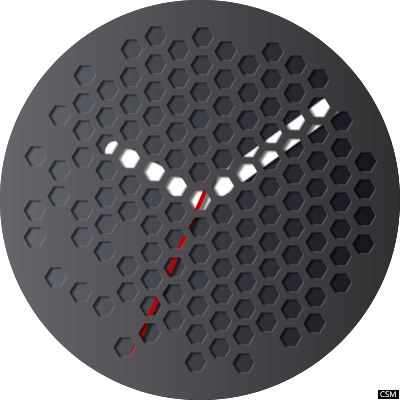
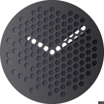
It looks awesome. Can I give you a few ideas?
Maybe that would lead to a different watch face, but I think it worth it.
use black instead of gray on the upper layer to have it as amoled friendly as possible.
-showing seconds looks great instead of just hour and minutes
-on the left (were 9 is on the clock) add the battery indicator with small digits. Or instead make 4 or 5 dots to change color. Or to loose color. Like 5 colored dots means battery is between 80% to 100%
-Another useful on the screen would be the date. (without month)
Useful ideas?
@Bogdan_Graur Good ideas! I didn’t think about this “amoled friendly” problem but you are right. For other ideas - I have always problem how close should I stay to original design and how much functionality should I use. The most important is of course battery level and I will add it.
Well, @Jacek_Klodzinski if you want to stay “faithful” to a design, of course you shouldn’t change anything.
But if you want to bring in YOUR OWN creativity into the game, use other people designs as inspiration and add what what really matters:
prolonged battery, making it less power hungry
-amoled friendly design (the IPS won’t matter) but saving some juice for other it would make a difference
-consider contrast and visibility especially when taken outside in sunlight. Examples yellow (or orange) on black is more visible then white on black background.
-always make different options like if someone likes your design buy would like orange accents instead of white, boom! With a little tweaking from you there are 2 different watch faces instead of just one.
-keep it simple. Too many details are useless sometimes anyway and only would lead to battery drain. Like weather. If someone wants weather, click on the watch few times and finds it. Keeping it on the front all the time, it eats up battery, for not too much use.
-same goes for the battery indicator. If you use 2 digits like battery level 77 it’s stressful to see Goin to 76 and next time you would look at the watch to see if it reached 75. Therefore, I think that keeping things in 5 dots (from 20 in 20%), would it be better. I think…
-date it’s very important. Small but there. People in schools/collage jobs in offices, needs to write date on paper all the time. If your watch face doesn’t have that, and people need to touch watch a few times to remember the date, it becomes a small inconvenience that people are not even aware of, just feel one day that they need another watch face.
maybe a small blue dot somewhere that remembers people that they are still connected to the phone, or that the watch lost connection and runs without phone. Light gray dot = no BT connection and dark marine dot = phone and watch linked. These info doesn’t have to pop in sight, just to be there, small if you want to know it.
-don’t add text on it like others that clutter display with “Swiss made” crap. If you want to sign your creations use your initials very hard visible, that’s enough. Like on black background us dark gray or on white use light gray. That’s my opinion.
-if possible, make an option that would keep the flavors of the main design but would be useful with always on display. (there, ditch all unnecessary stuff, and keep it really dark and simple.
If other ideas pop in my head, I’ll let you know
What do you think?
Definitely keep me updated with your designs. You have talent.
@Bogdan_Graur Only truth. Thank you. It is always good to listen to wise people I have almost identical rethinking and good to know that others think the same.
Btw. your first name seems to be Polish.

 I have almost identical rethinking and good to know that others think the same.