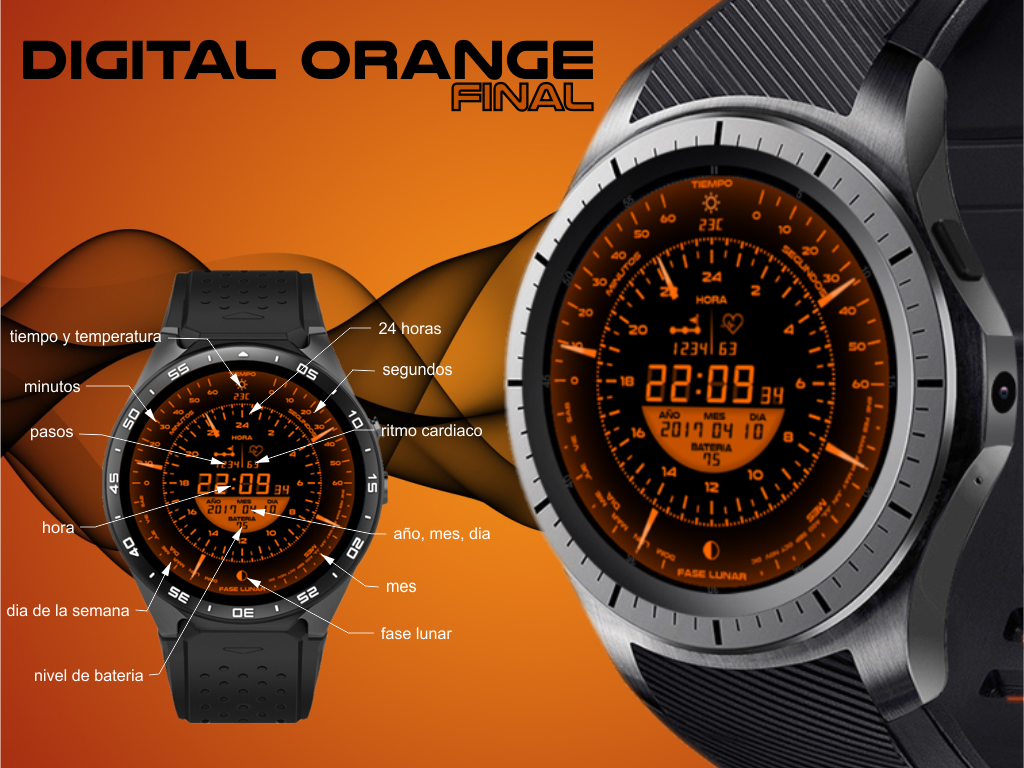
Here I leave the final version of DIGITAL ORANGE. I have had to change some design for the perfect operation of all its functions. I hope you like the final result.
@el_golant My intention has always been to make everything orange. I see no need to add more colors. Another thing is to make more spheres with other colors … Thanks for your opinion.
Gabi I was just suggesting that a code of some kind could be placed in a corner with each new face that would indicate which watch series that it would install on. This would be helpful to newer members.
Although the overall look is interesting, I found the text too small to read. Specially the text on the bottom left (3’o clock to 6’o clock) and right (6’o clock to 9’o clock) region.
I like this watch and all the information it shows. I found a small bug though which I am unable to correct. On Sundays the hand jumps up again instead of starting at the lowest point. Is there any easy way to correct this or does this need a correction of the background picture?